Beyond the Blue Dot is a web-based visualization tool for exploring the city at the human scale. It finds the personal stories embedded in large-scale urban data and describes urban locations through these stories. To do so, it distills urban quantitative data into synthetic narratives about an area’s residents and workers. With this platform, I am proposing a humanistic counterpoint to the current dominant paradigm of top-down modernist urban analysis and research that pervades through urban planning and design. This project proposes a novel approach to crafting narratives from existing place-based data, such as census data. It stems from the idea that empathy can arise from “walking a mile in a person’s shoes.” The project was developed for my Urban Planning capstone project - full paper and documentation available here.
The title, Beyond the Blue Dot, is a play on the ubiquitous blue dot that represents people in Google Maps. Rather than abstracting individuals as blue dots, this project gives them a voice. It engages with locations through the people that either live or work in these locations. By doing so, this platform explicitly recognizes the humanity of these individuals. Secondarily, the blue dot also references the shared universal quality of the project with the Pale Blue Dot, an iconic image of the earth from space.
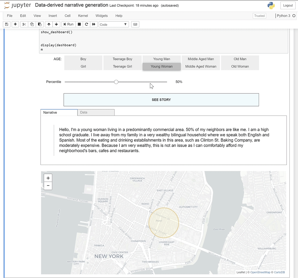
The project cares about the everyday lives of these populations with particular regards to their experiences, both personal and urban. As the project is looking at small-scale urban networks through the lens of peoples’ experiences, the urban metrics explored in this project are defined by a half-mile radius around a location. This constitutes a 10-minute walking distance, slightly more than the typical 5-minute walking distance which research suggests that people are willing to walk rather than drive.
By combining elements of creative storytelling with traditional quantitative data, it provides an avenue for poetism in the urban research process. It fills a void in understanding the people who inhabit a location by describing them through stories from their own perspectives. This project subverts the general paradigm of location-centered data analysis by asking the following human-centered questions: Who lives here? Who works here? What do their lives look like?
By describing places through the experiences of their inhabitants, the platform helps build empathy for the people who live and work in the places being studied. The two subjects described by the narratives are worker and resident population groups. Residents refer to those who live in an area, while workers refer to those who work in an area. Both groups are characterized using readily available large-scale data published by the US Census Bureau and other data sources.
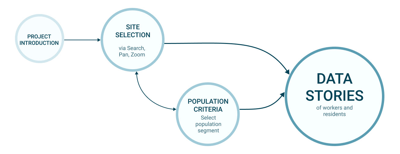
It consists of two distinct features: a mapping visualization, where users interactively select the study location, and a text generation interface where users create subject profiles for the narratives. Both of these components work in tandem to display and update narratives that reflect a given study area.
This project’s target audience is urban planning and design professionals concerned with the impacts of their designs, policy decisions and recommendations on people. These can be urban planners, designers, architects, transportation planners, or urban policy consultants and computational designers. As these professionals routinely make policy decisions and recommendations, it is important that they have a way to understand the experiences of the people they potentially affect.
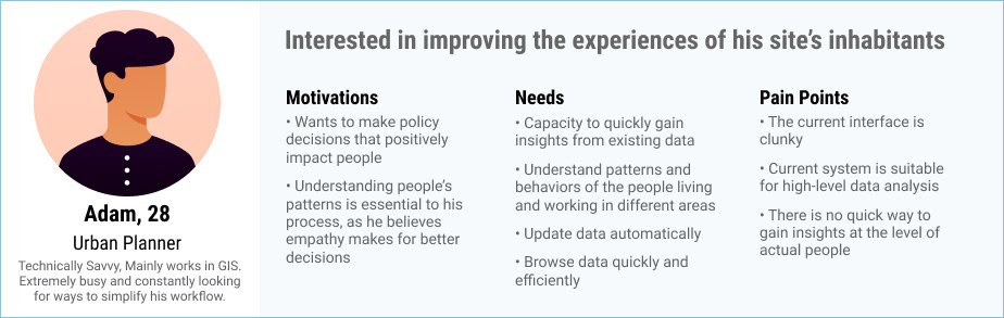
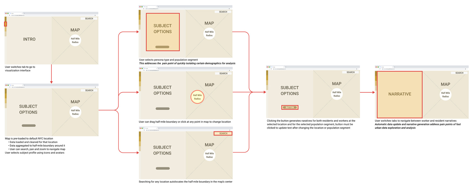
User Persona
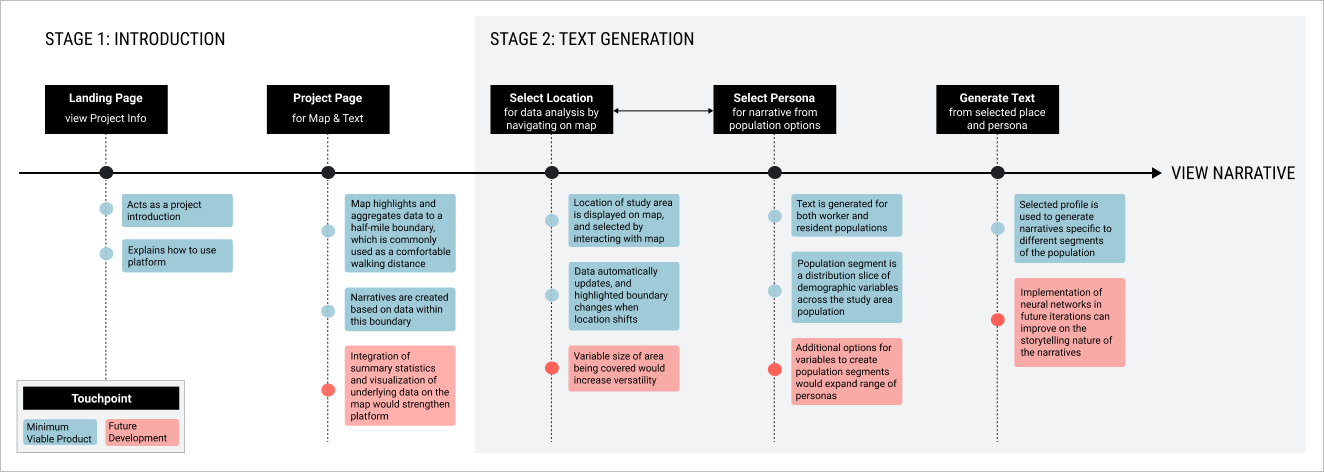
After the project introduction, users get acclimatized to the project through the split-screen map visualization and text generation interface. Demographic options of both percentile and age/sex are displayed on one half of the screen. Users select from defined age/sex groups, such as young woman or teenage boy, and the selected demographic group’s level of representativeness of the whole group. This interface also houses the text generation button. On the other half of the screen, the map is pre-loaded at a zoomed-in scale to the New York City test site location, around which a highlighted walking boundary is drawn.
When the button is clicked, narratives are generated for both residents and workers based on the selected demographic slice. Any subsequent changes to the population segment or location require users to re-generate text, at which point the underlying data automatically updates to reflect changes in either the study area location or subject profile.
User Journey
Wireframe
The minimum viable product was developed for this project with a study location in New York City’s Lower East Side as the test site. Only the data collection, processing and text generation elements were built for residential populations. This same process can be repeated to generate workers’ data and include more comprehensive data, including travel information.
As the current working prototype a minimum viable product, it functions as a proof-of-concept. Future iterations will build on the existing narrative generation while improving upon storytelling and visualization.