Can a spatial data visualization platform generate empathy by humanizing data through narrative?
BACKGROUND
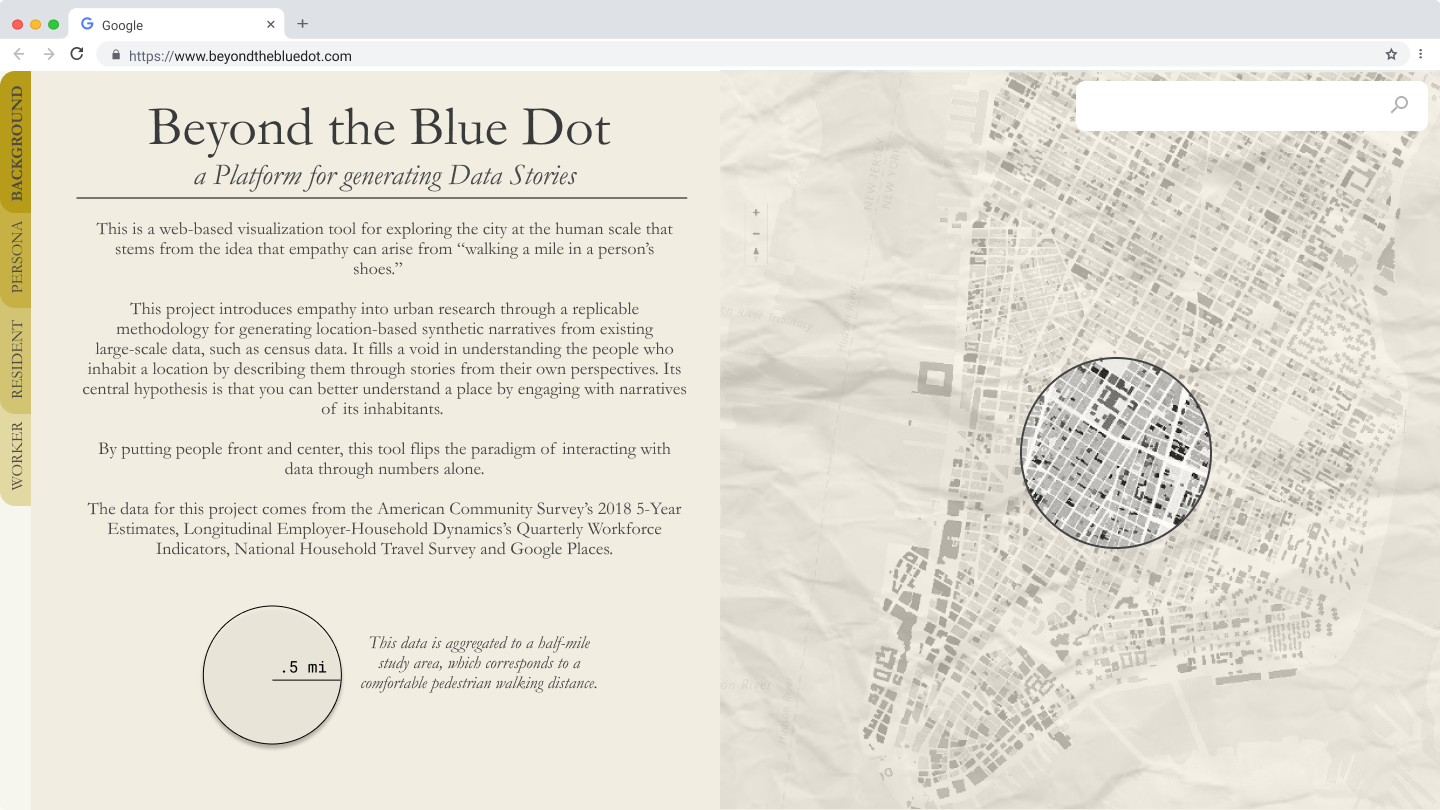
Project: Beyond The Blue Dot
Purpose: Capstone Project for MS Urban Planning, Columbia GSAPP
Scope: UX Design, Visual Design, Prototyping, Computational Design (Design Technology)
Programs: Figma, Adobe XD, Python
Duration: Spring 2020 (Four Months)
Advisor: Professor Anthony Vanky
Reader: Violet Whitney
Client: Sidewalk Labs
Purpose: Capstone Project for MS Urban Planning, Columbia GSAPP
Scope: UX Design, Visual Design, Prototyping, Computational Design (Design Technology)
Programs: Figma, Adobe XD, Python
Duration: Spring 2020 (Four Months)
Advisor: Professor Anthony Vanky
Reader: Violet Whitney
Client: Sidewalk Labs
Full project and documentation available here.
DESCRIPTION
Beyond the Blue Dot is a web-based visualization tool for exploring the city at the human scale. It distills large-scale urban quantitative data into personal synthetic narratives about a given place’s residents and workers.
This project proposes a novel approach to crafting narratives from existing place-based data, such as census data. It stems from the idea that empathy can arise from “walking a mile in a person’s shoes.” As this platform uses constantly updated national data sources, it can be used for locations anywhere within the United States of America.
The title, Beyond the Blue Dot, is a play on the ubiquitous blue dot that represents people in Google Maps. Rather than abstracting individuals as blue dots, this platform explicitly recognizes their humanity. Secondarily, the blue dot also references the shared universal quality of the project with the Pale Blue Dot, an iconic image of the earth from space.
PROBLEM STATEMENT
Suppose you’re an urban planner working on a transportation project and one of your main aims is to implement it with as little disruption to the area’s flow of people as possible. You know that it would be helpful to figure out the area’s resident and worker population, their transportation habits, their incomes and other personal information.
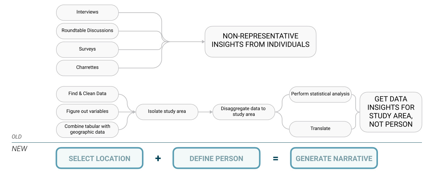
Doing so through existing mapping software such as ArcMap or qGIS would involve a tedious, long and involved process of collecting data, transforming it in multiple ways, extracting relevant information, and trying to piece together a picture of individuals that are representative of the study area. Other means of collecting data, such as roundtables or community discussions, are not generalizable and can include non-representative perspectives.
There is no streamlined workflow for urban design and planning professionals to extract information at the scale of an individual from large-scale data.
With this tool, it is possible to synthetically construct narratives describing typical and outlier populations based on large-scale urban data through a seamless workflow. This project proposes a humanistic counterpoint to the dominant paradigm of top-down, modernist urban analysis by asking: Who lives here? Who works here? What do their lives look like?
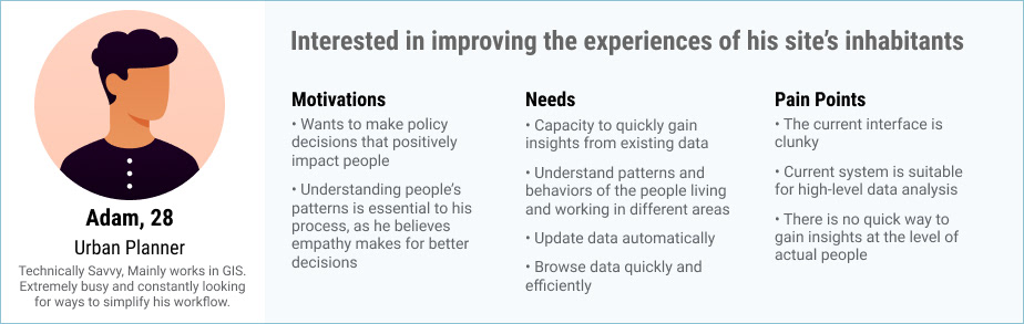
USER PERSONA
This tool’s user was crafted through feedback from multiple conversations with urban planning practitioners about their needs and workflows. The main takeaways were that the product would have to be easily navigable, intuitive, and fast to be incorporated into existing workflows.
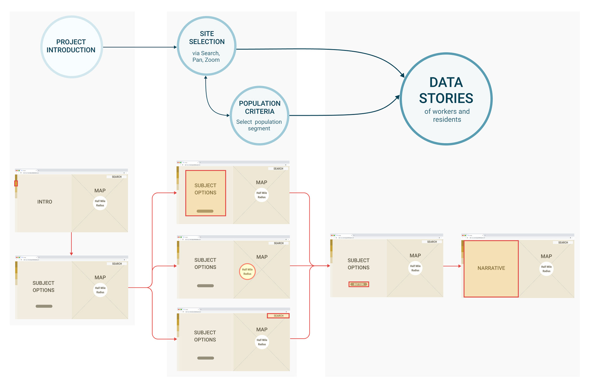
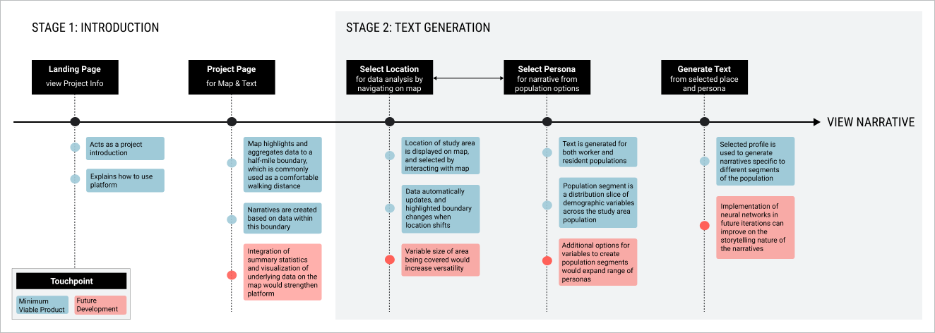
USER FLOW
This stemmed from the user persona’s needs, and valued ease of use above all else. As a result of the time constraints, the user flow is quite linear - after being introduced to the platform and its interface, the user selects a subject profile and location for the narrative and then generates a location-based narrative for the selected prototypical person.
Diagramming out the user interactions and flow through a wireframe was helpful in making design decisions, understanding the user experience and streamlining the technical aspects of the tool’s development.
ITERATIONS
Early prototypes focused on mapping out the user interface and identifying the tool’s main features. User testing of preliminary prototypes indicated that while the split screen for mapping and narratives was clear, the navigation as a whole was not intuitive enough. As the project developed further, the user interactions and visual language of the prototypes became more refined. However, a key missing piece was personalization. In the early iterations, the proritization of narrative data over raw numbers was not sufficient.
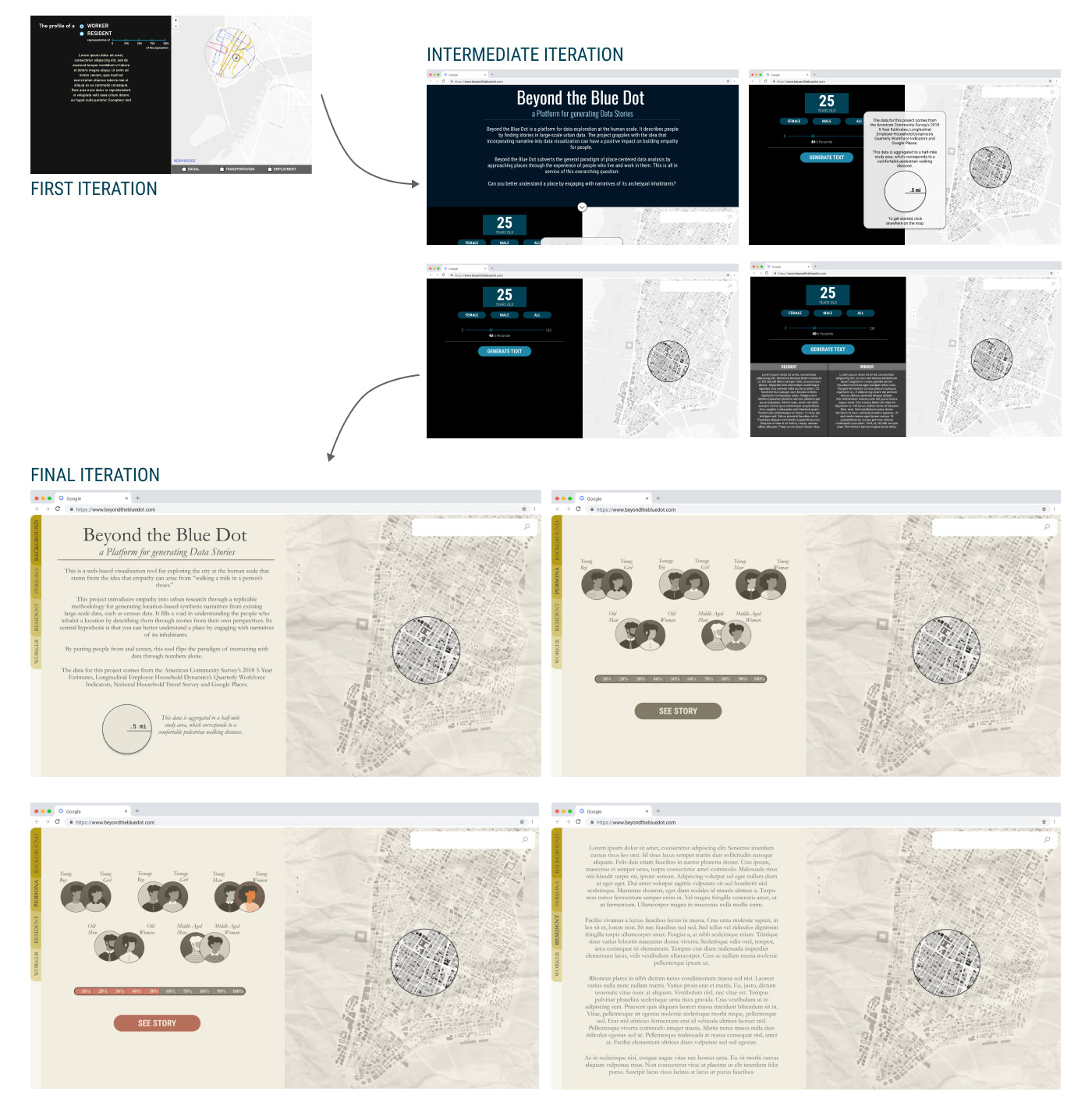
Based on user tests and feedback, the final iteration of the prototype honed in on intuitiveness, ease of use, and a visual statement of its human-centered goals. This resulted in a visual language that tended towards skeumorphism and personification of the subject profiles and population segments these subjects were representative of through avatars. The half-mile boundary is representative of the urban planning standard for a comfortable pedestrian walking distance, and was chosen to lean into the idea of narrating an individual’s space-based experience.
MINIMUM VIABLE PRODUCT
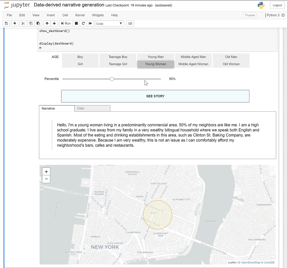
The minimum viable product as-built serves as a proof-of-concept. It developed only the essential features of the product, and used a study location in New York City’s Lower East Side as the test site.
The data collection, processing and text generation features were built, but only for residents. Future development would incorporate the same features for workers and include more comprehensive data, including travel information. Critically, it would also improve upon the storytelling elements of the platform.
The project was built on a jupyter notebook, but will be developed as a web-based program. Primarily, data is imported through APIs and the data sources selected make the process replicable. These include the U.S. Census Bureau’s ACS 5-Year Estimates, Longitudinal-Employer Household Dynamics Program’s Quarterly Workforce Indication (QWI), Federal Highway Administration (FHWA)’s National Household Travel Survey and Google Places API.
To generate the synthetic narratives, a pipeline is run in Python. These processes are all done using Python libraries and modules, including ipyleaflet, geopandas, numpy, and pandas. This includes interactive data visualization on a map, data collection, and data processing.
REFLECTION
While this project’s development of a replicable methodology for transforming quantitative data into narrative is commendable, inclusion of natural language processing would have pushed the storytelling component even further. Integrating summary statistics and adding options for walking distance adjustment would have increased the tool's utility.